The amateur theater company "Théâtre Tout Terrain" (TTT) asked me to guide and support them in the redesign of their brand identity. Established for 10 years, the team wanted to modernize its image and give itself a more professional identity that harmonized with its values.

In 2021, the amateur theater company "Théâtre Tout Terrain" (TTT) asked me to guide and support them in the redesign of their brand identity. Established for 10 years, the team wanted to modernize its image and give itself a more professional identity that harmonized with its values.
The TTT company is socially involved and committed to creating and offering shows to as many people as possible. To fulfil this goal, it is constantly evolving and travelling, to meet its diverse audiences.
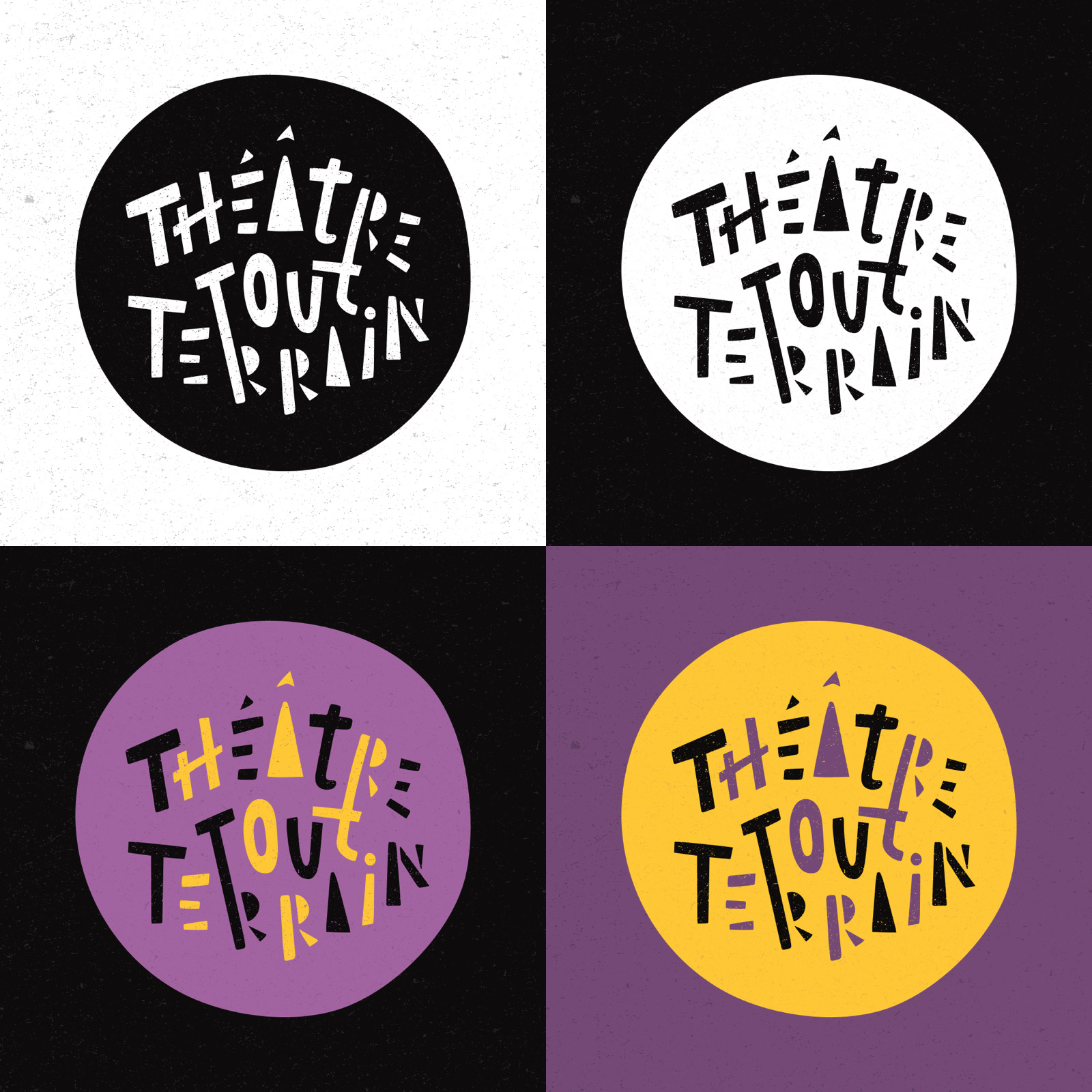
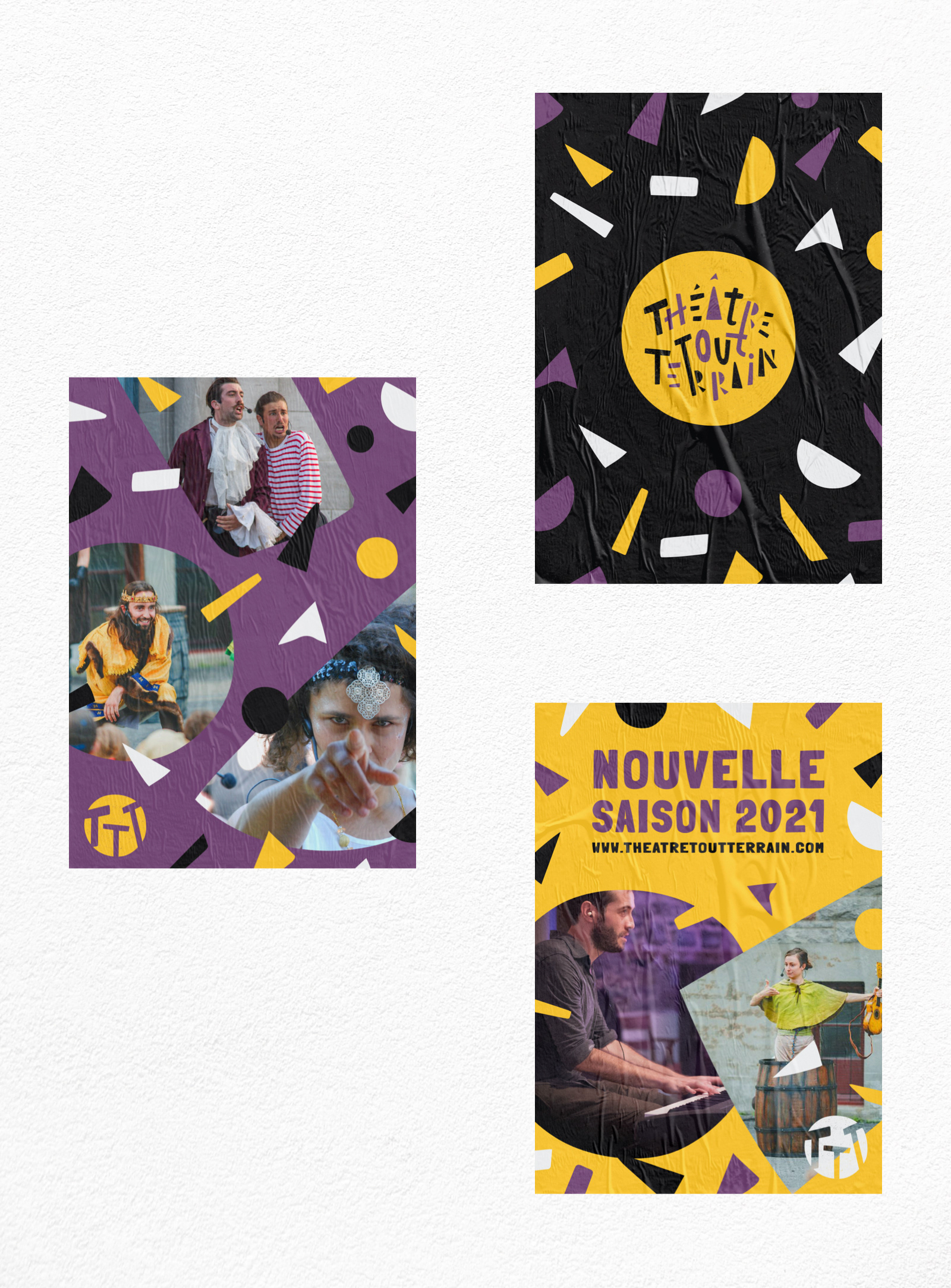
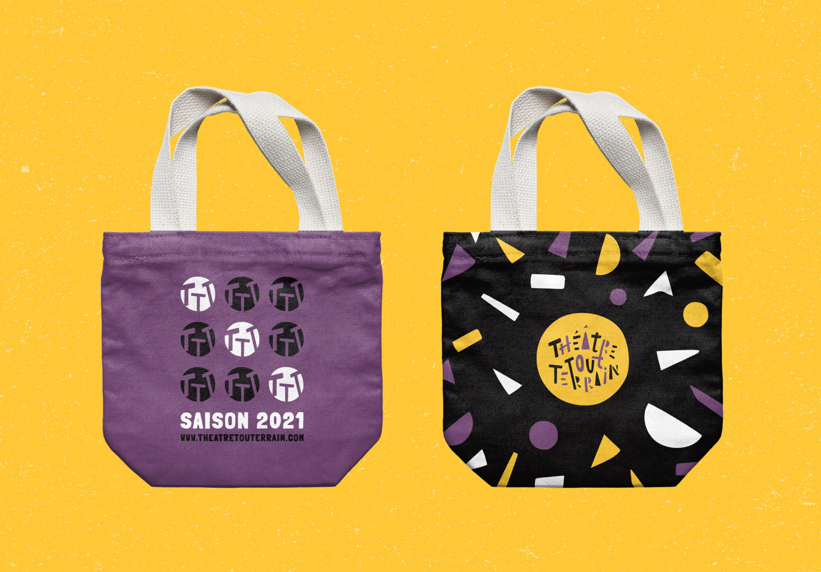
The logo symbolizes the space (the circle) in which irregular and disparate forms assemble to create a whole, an entity. The words are connected to each other by links, like the bridges created between performers, spectators, and cultures. The “handmade,” textured, and raw aspects of the logo reinforce the artisanal, authentic and people-focused side of this company.
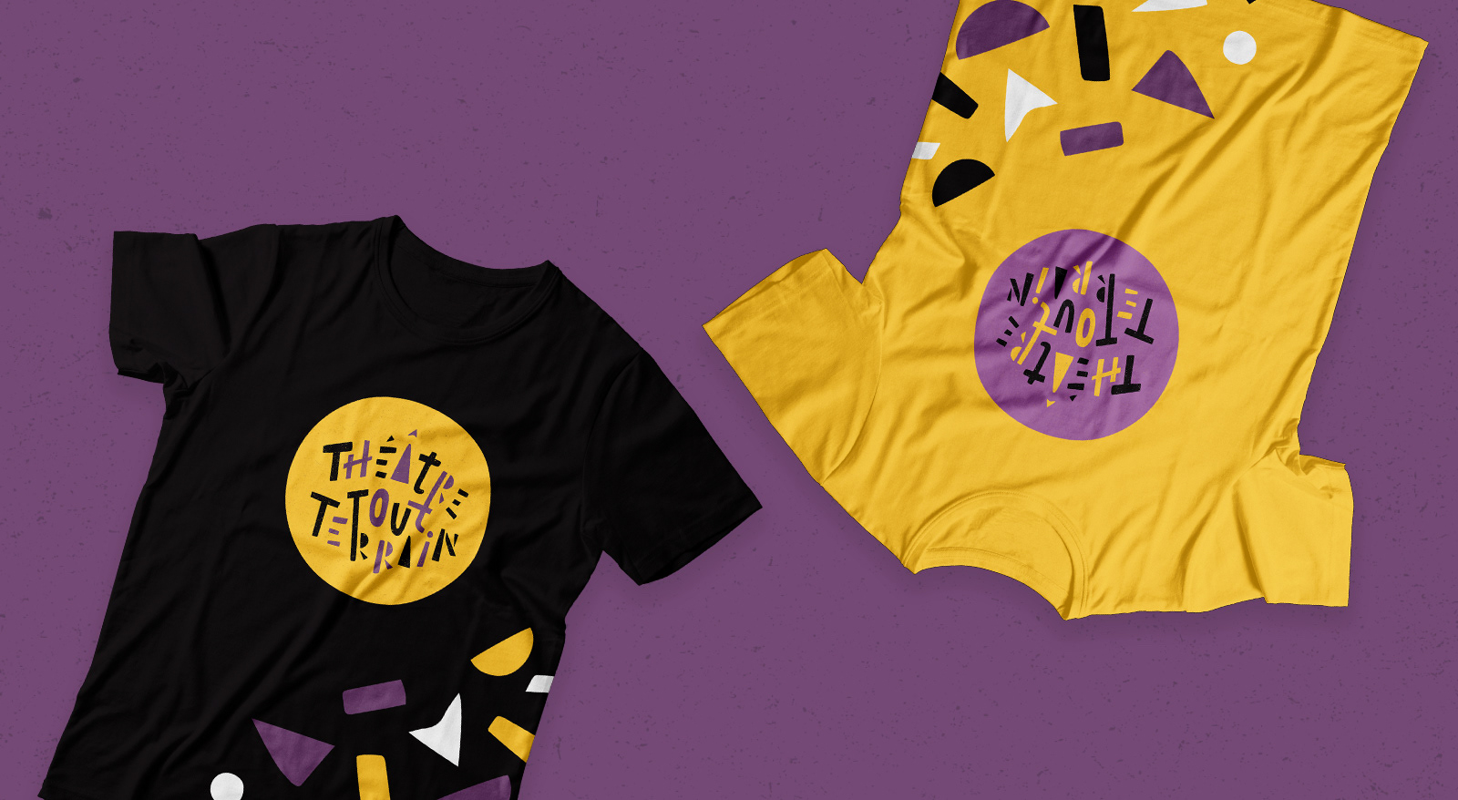
Both serious and playful, the logo and its graphic elements are easily executed in different forms and colors, offering the company many possibilities of communication for their brand.